
Mobile App Patch 1.0
📱 PLAYER ONE NETWORK MOBILE — VERSION 1.0 Patch Notes • September 18–19, 2026 After the first Alpha builds, rapid testing, redesigns, fixes, and a lot of refinement, Player One Network Mobile is taking…
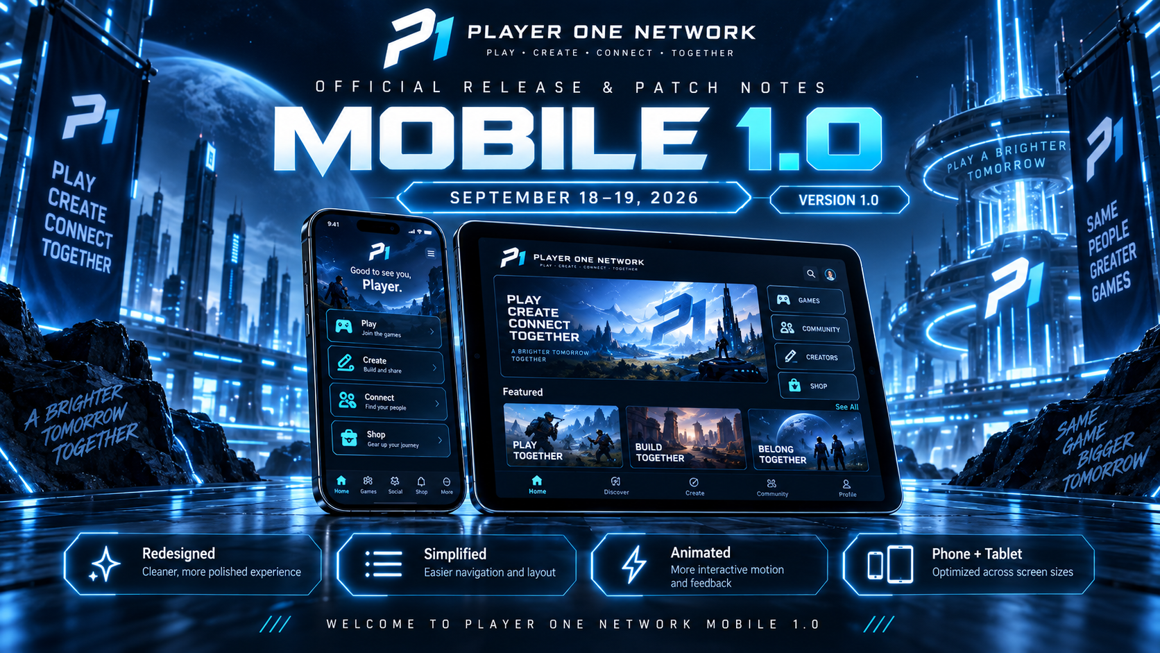
📱 PLAYER ONE NETWORK MOBILE — VERSION 1.0
Patch Notes • September 18–19, 2026
After the first Alpha builds, rapid testing, redesigns, fixes, and a lot of refinement, Player One Network Mobile is taking its biggest step yet.
🚀 Welcome to Player One Network Mobile 1.0
Version 1.0 represents a major redesign of the mobile experience.
The goal was not simply to add more features.
It was to make the app:
Cleaner. Faster to understand. More interactive. More mobile-focused.
Player One Network on a phone should not feel like the desktop site squeezed onto a smaller screen.
It should feel like an app.
Version 1.0 is the beginning of that experience. Also friendly reminder it can be accessed at https://playeronenetwork.com/app
🎨 MAJOR 1.0 DESIGN OVERHAUL
The overall Player One Mobile interface has been redesigned again for the 1.0 milestone.
This update focuses heavily on simplifying the experience while making it feel more polished and alive.
Changes include:
- Cleaner screen layouts.
- Less unnecessary visual clutter.
- Improved spacing.
- Better content hierarchy.
- More consistent card sizing.
- Improved alignment.
- Cleaner navigation.
- Better use of available screen space.
- Stronger Player One branding.
- More cohesive styling between different areas of the app.
The interface should now feel much more intentional instead of simply presenting every available feature at once.
📱 BUILT AROUND MOBILE FIRST
Version 1.0 continues the shift toward a truly mobile-first experience.
Information has been reorganized around what makes sense when using P1 on a phone or tablet.
That means:
- Faster access to important features.
- Less unnecessary information on each screen.
- Larger touch-friendly controls.
- More compact content where appropriate.
- Better spacing between interactive elements.
- More natural scrolling.
- Clearer visual priorities.
The idea is simple:
Get where you want to go faster.
✨ MORE ANIMATIONS
Version 1.0 significantly expands animation throughout the app.
Animations are being used to make actions feel more responsive and interactive rather than making the interface unnecessarily flashy.
New or improved animation areas include:
- Page transitions.
- Navigation interactions.
- Content cards.
- Buttons.
- Loading states.
- Status changes.
- Progression elements.
- Player One branding.
- Screen entry effects.
- Interactive feedback.
Small movement throughout the interface helps make P1 Mobile feel much more alive.
🚀 IMPROVED STARTUP EXPERIENCE
The animated Player One Network startup sequence has been refined as part of the 1.0 release.
Opening the app now feels more like entering the P1 ecosystem rather than simply loading another screen.
The startup experience better establishes the:
Player One Network identity
before bringing you into the app.
🧭 SIMPLIFIED NAVIGATION
Navigation received another cleanup pass.
One of the biggest goals for 1.0 was making the app easier to understand without requiring users to dig through unnecessary menus.
Navigation has been simplified around the features members are most likely to use.
This includes improved access to areas such as:
🏠 Home
💬 Lobby
🎬 Videos
📚 Knowledge
🏅 Achievements
🛍️ Shop
👤 Profile
The experience is designed to feel more direct and predictable.
🏠 HOME SCREEN REFINEMENT
The Home screen received substantial cleanup during the move toward 1.0.
Updates include:
- Improved spacing.
- Better alignment.
- Cleaner cards.
- More consistent margins.
- Better separation between sections.
- Improved responsive behavior.
- More polished content presentation.
The Home page should now feel more balanced and easier to scan.
💬 THE LOBBY — MOBILE POLISH
The Lobby received additional mobile-specific design work.
One issue involved the spacing between the Lobby message/post composer and the status section.
The two areas previously appeared too close together, making the interface feel cramped.
✅ Spacing Improved
Additional separation has now been added between these sections.
This creates:
- Better visual hierarchy.
- Cleaner composition.
- Easier interaction.
- Less cramped mobile layouts.
Small spacing changes like this are a major part of the 1.0 polish process.
🟢 LIVE PULSE IMPROVEMENTS
Live Pulse continues to be refined for mobile.
The system has been designed to occupy less space while still making community activity easy to see.
Updates focus on:
- Cleaner status presentation.
- Better spacing.
- More compact layouts.
- Improved animations.
- Better visual feedback.
- Improved integration with the Lobby.
Live Pulse is meant to feel like part of the social experience rather than a separate oversized panel.
📐 BETTER ALIGNMENT THROUGHOUT THE APP
Several screens had elements that were technically functional but weren’t aligned consistently.
That received another large cleanup pass.
Fixes include:
- More consistent card positioning.
- Better horizontal spacing.
- Improved vertical spacing.
- Cleaner section gaps.
- Better button alignment.
- Improved icon positioning.
- More consistent margins.
- Better text centering.
These improvements are especially noticeable on mobile screens where even small alignment differences are easy to spot.
🏅 ACHIEVEMENT UI CLEANUP
Achievement navigation continues to receive refinement.
Tabs and category selectors have been adjusted so text sits more naturally within their containers.
Areas such as:
Lobby • Community • Videos • Knowledge • More
now have:
- Better centering.
- Improved spacing.
- More consistent sizing.
- Cleaner responsive behavior.
Achievement browsing should feel significantly more polished in 1.0.
🖥️ TABLET EXPERIENCE
Player One Mobile 1.0 continues to support tablets and larger mobile displays.
Instead of simply stretching phone layouts, larger screens can use additional space more intelligently.
This includes:
- Wider layouts.
- Expanded cards.
- Multi-column content.
- Better spacing.
- Larger media presentation.
- Improved Achievement browsing.
- Better Shop layouts.
- Improved Knowledge layouts.
- More appropriate navigation placement.
Phone and tablet users should both receive an experience designed around their screen size.
🛍️ SHOP INTEGRATION
The Player One Shop remains part of the 1.0 mobile experience.
Users can browse Player One products directly from within the app.
The Shop experience includes:
- Product browsing.
- Responsive product cards.
- Mobile-friendly layouts.
- Cart access.
- Product information.
- Checkout integration.
This keeps another major part of the P1 ecosystem accessible without leaving the mobile experience.
🎬 VIDEO EXPERIENCE
Video content continues to receive mobile optimization.
Version 1.0 focuses on making video browsing easier on smaller displays with:
- Better card sizing.
- Improved spacing.
- Responsive layouts.
- Cleaner information hierarchy.
- Better use of tablet space.
Video remains an important part of Player One Mobile and will continue to evolve in future updates.
📚 KNOWLEDGE ON MOBILE
Player One Knowledge also continues to receive responsive improvements.
The 1.0 interface makes it easier to browse guides and educational content without overwhelming smaller screens.
Improvements include:
- Cleaner guide cards.
- Better responsive layouts.
- Improved tablet grids.
- More readable spacing.
- Better navigation.
Knowledge remains fully connected to the wider Player One ecosystem.
🎨 CONSISTENT PLAYER ONE DESIGN
A major focus of Version 1.0 is consistency.
Across the app, interfaces are being brought under the same visual system.
That means more consistency between:
- Colors.
- Borders.
- Cards.
- Buttons.
- Spacing.
- Typography.
- Icons.
- Animations.
- Navigation.
The goal is for every area of the app to immediately feel like it belongs to Player One Network.
⚡ A SIMPLER EXPERIENCE
More features do not automatically make a better app.
Version 1.0 intentionally simplifies several areas of the experience.
Instead of presenting everything at once, information is being organized around:
What matters right now.
This reduces clutter and makes P1 Mobile easier to use casually throughout the day.
The app should be something you can quickly open, check, interact with, and move on from.
🧹 VERSION 1.0 POLISH PASS
A large portion of the work between September 18 and September 19 focused on smaller polish improvements.
These include:
- Uneven spacing corrections.
- Misaligned elements.
- Improved section separation.
- Better card proportions.
- Cleaner typography.
- More consistent padding.
- Improved button positioning.
- Better tablet scaling.
- Less crowded screens.
- Improved responsive behavior.
Individually, these changes may seem small.
Together, they make the app feel considerably more finished.
🐛 BUG FIXES
The first Alpha builds helped identify several issues that needed attention before 1.0.
Work during this development window included continued cleanup around:
- Home screen behavior.
- Navigation.
- Badge handling.
- Responsive layouts.
- Content spacing.
- Screen alignment.
- Lobby presentation.
- Tablet scaling.
The goal is to keep reducing the friction testers experienced during the earlier Alpha versions.
📋 PLAYER ONE MOBILE 1.0 HIGHLIGHTS
Here are the biggest changes in this release:
🚀 Player One Mobile reaches Version 1.0
🎨 Major interface redesign
📱 More mobile-first presentation
🧭 Simplified navigation
✨ Expanded animations and interactions
🏠 Cleaner Home experience
💬 Lobby layout improvements
🟢 Live Pulse refinements
📐 Major alignment and spacing cleanup
🏅 Achievement tabs improved
🖥️ Tablet layouts further refined
🛍️ Shop remains fully integrated
🎬 Video layouts improved
📚 Knowledge browsing refined
⚡ Less clutter throughout the app
🐛 Additional Alpha-era bugs corrected
🎯 WHAT VERSION 1.0 MEANS
Version 1.0 does not mean development stops.
It means the foundation of the Player One Network mobile experience has reached an important milestone.
The app now has a clearer direction for:
- Navigation.
- Design.
- Mobile interaction.
- Tablet support.
- Community features.
- Content discovery.
- Animations.
- Player progression.
- Shopping.
- Future expansion.
There is still plenty to build.
🔮 WHAT COMES NEXT
Future mobile updates can build on the 1.0 foundation rather than continuously reinventing the core interface.
Areas we expect to continue improving include:
- Performance.
- Animations.
- Community integration.
- Creator functionality.
- Video.
- Profiles.
- Notifications.
- Live Pulse.
- Achievements.
- Shop integration.
- Tablet optimization.
- Additional P1 services.
Version 1.0 is the foundation.
The next updates are about building on it.
💙 PLAYER ONE IN YOUR POCKET
Player One Network has always been about building one connected place for gaming, technology, creators, community, and players.
Mobile brings that idea somewhere new.
Your community.
Your content.
Your progression.
Your Player One identity.
Wherever you are.
Thank you to everyone who tested the Alpha builds, reported issues, and helped shape the direction of the app.
Those early builds directly influenced what Version 1.0 has become.
📱 Welcome to Player One Network Mobile 1.0.
Play. Create. Connect. Together. 🎮💙
— Player One Network
COMMUNITY DISCUSSION
Join the conversation