
Patch Notes #5
🎮 PLAYER ONE NETWORK — PATCH NOTES Player One Network 2.0 + Forums Update September 20, 2026 A major new chapter for Player One Network has started. Over the latest development cycle, work has…

🎮 PLAYER ONE NETWORK — PATCH NOTES
Player One Network 2.0 + Forums Update
September 20, 2026
A major new chapter for Player One Network has started.
Over the latest development cycle, work has focused on two major areas:
🌐 The new Player One Network 2.0 experience
💬 Continued improvements to Player One Forums
This isn’t simply a new coat of paint.
Player One Network 2.0 is about making the entire platform feel more connected, more community-focused, more modern, and more distinctly P1.
🚀 PLAYER ONE NETWORK 2.0
Welcome to the New Player One
The Player One Network homepage has received a major redesign as part of the 2.0 visual direction.
The goal is to better communicate what P1 actually is becoming:
Gaming. Technology. Creators. Community. Videos. Guides. Discussions.
Instead of presenting everything as separate pieces, 2.0 starts bringing them together into one central experience.
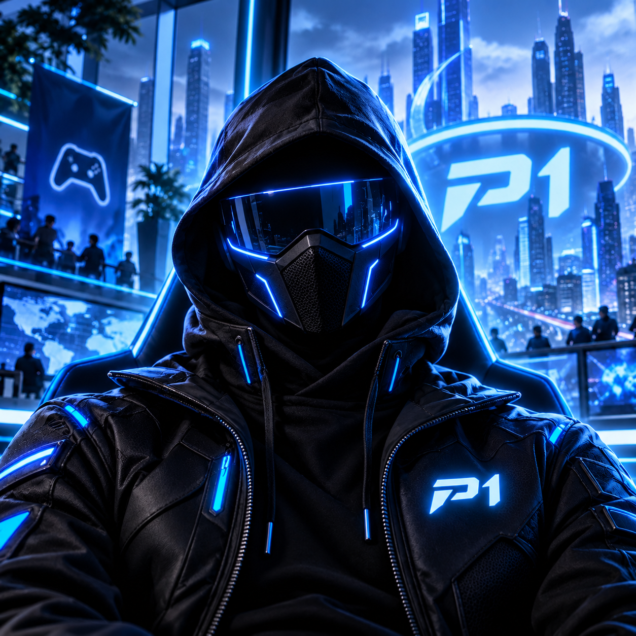
🌆 NEW CINEMATIC HERO EXPERIENCE
One of the most noticeable changes is the completely redesigned homepage hero.
The new direction uses a much more cinematic presentation built around the idea of the Player One community itself.
The new hero focuses on:
- A larger panoramic presentation.
- Futuristic city/community imagery.
- Stronger Player One branding.
- Better use of the full available screen width.
- Improved image positioning.
- Better visual balance between artwork and text.
- A darker text area for readability.
- More depth without overwhelming the rest of the homepage.
The main message of the new experience:
Play • Create • Connect • Belong
That line represents where Player One Network is heading.
Not just somewhere you visit.
Somewhere you belong.
🎨 A NEW P1 VISUAL LANGUAGE
Version 2.0 introduces a more consistent visual system across the network.
That means cleaner use of:
- Dark navy surfaces.
- Player One blue.
- Cyan highlights.
- White typography.
- Subtle transparency.
- Controlled glow effects.
- Cleaner spacing.
- Sharper interface lines.
- More deliberate animation and depth.
The goal is to keep the gaming/technology identity while making P1 feel cleaner and more mature.
🧭 NEW HEADER
The primary site navigation has been redesigned as part of the 2.0 experience.
The new header brings important parts of Player One Network together in one consistent location.
That includes access to:
🔎 Search
🧭 Main Navigation
👤 Player Account
🛒 Store Cart
💬 Discord
The updated header is designed to be easier to understand while keeping commonly used destinations accessible.
💬 DISCORD BUTTON CLEANUP
The Discord call-to-action also received additional visual refinement.
The button/icon presentation has been cleaned up so it better fits the new 2.0 header instead of visually competing with the rest of the navigation.
This keeps Discord prominent without making it feel disconnected from the P1 design.
📊 NETWORK SNAPSHOT
A new Network Snapshot section helps show what’s actually happening across Player One Network.
Instead of filling the homepage with meaningless static statistics, the new direction focuses on information coming from real areas of P1.
One example is the Forums.
Forum Activity
The homepage topic total now reflects actual Forum topics rather than an unrelated post count.
As the Forums grow, the homepage can better represent genuine activity taking place across the community.
🎬 FEATURED VIDEO — NOW ACTUALLY FEATURED
The Featured Video section has also been improved.
Rather than manually displaying an arbitrary video, P1 can now surface the most-viewed public video.
That means the featured area better represents what the community is actually watching.
During development, the current leading video was:
GTA 6 Trailer — 30 Views
As viewing activity changes, the featured content can change with it.
This makes the homepage more dynamic and community-driven.
📰 LATEST ARTICLES CLEANUP
The latest-content area has been intentionally kept compact.
Instead of filling the homepage with article after article, the Latest Articles section is limited to a smaller group of recent stories.
The focus remains on:
- Easier scanning.
- Less clutter.
- Better visual balance.
- Giving each story more room.
Player One 2.0 is moving away from the idea that more content on screen automatically means a better homepage.
🌐 SIX MAIN ENTRY POINTS
The homepage now provides clearer paths into the major areas of Player One Network.
Rather than making new users figure out where everything lives, the homepage helps guide members toward the different parts of P1.
This gives the network a stronger central hub instead of feeling like a collection of unrelated pages.
⚡ WHAT’S HAPPENING
The homepage also introduces a What’s Happening area designed to better surface activity around Player One Network.
The long-term goal is for the homepage to feel alive — showing what’s happening across content, creators, Forums, and the wider community.
The homepage should tell you:
What’s happening on Player One right now?
not simply show a static collection of links.
🦶 NEW FOOTER EXPERIENCE
The footer has also been redesigned to match the rest of Player One Network 2.0.
It now shares the same visual language as the header and homepage rather than feeling like an unrelated piece attached to the bottom of the site.
This is part of a larger effort to create consistent presentation throughout P1.
🖼️ HERO POSITIONING & DISPLAY FIXES
A large amount of refinement went into getting the new cinematic hero presentation right.
Several improvements were made around:
- Centering the artwork.
- Preserving important areas of the background.
- Preventing important subjects from being cropped.
- Better handling of wide displays.
- Creating a full-width cinematic appearance.
- Maintaining readable text.
- Preventing branding/text from clipping.
- Removing artificial/repeated image fills.
The final direction favors a proper panoramic presentation rather than stretching or artificially repeating parts of the hero artwork.
🔗 EXISTING PLAYER ONE SYSTEMS REMAIN CONNECTED
One important part of 2.0 is that the redesign isn’t intended to erase the systems already being built.
The new visual experience continues to sit around the larger P1 ecosystem, including areas such as:
💬 Forums
🎬 Videos
📚 Knowledge
🛒 Store
👤 Accounts
🏆 Achievements
⭐ Progression
👥 Community
Player One 2.0 is the next visual layer connecting those systems together.
💬 PLAYER ONE FORUMS — NEW UPDATE
The Forums have also received several new member-facing improvements since the previous Forum patch notes.
The focus this time has been less on the overall visual redesign and more on improving how people actually write and participate in discussions.
✍️ NEW POST FORMATTING TOOLS
Forum posts and replies now have a much more capable formatting toolbar.
Members can use tools including:
Bold
Italic
Underline
Strikethrough
Quotes
Code
Lists
Links
Emojis
This makes topics and replies much more expressive than plain-text discussions.
📝 BETTER LONG-FORM POSTS
The new formatting system is particularly useful for conversations such as:
- Guides.
- Tutorials.
- Troubleshooting.
- Build instructions.
- Reviews.
- Detailed discussions.
- Community projects.
- Technical help.
Forums are supposed to support conversations that need more depth than a quick Lobby post, and the editor is being improved around that goal.
💬 DIRECT QUOTING
Members can now directly quote another Forum post when responding.
Quoted content appears inside its own styled quote area, making it much easier to tell:
- What someone originally said.
- Which part of the discussion you’re responding to.
- Where your new response begins.
This becomes especially useful when a topic contains several different conversations happening at once.
🔗 VIEW ORIGINAL
Quoted posts can also include a View Original option.
That lets readers jump back to the post being referenced instead of manually searching through a long discussion.
For larger topics, this makes following conversations substantially easier.
✏️ EDIT YOUR OWN POSTS
Members can now return to their own Forum content and make corrections after posting.
This is useful for:
- Fixing mistakes.
- Updating outdated information.
- Correcting links.
- Improving formatting.
- Adding missing information.
- Updating guides or instructions.
You don’t need to create another reply simply because you noticed a typo five seconds after pressing Post.
📝 EDITED INDICATOR
When a post has been changed, the Forum can display an Edited indicator.
This keeps discussion history more transparent while still allowing members to correct and improve their own content.
🔵 BETTER “START TOPIC” BUTTON
The Start Topic action has received another visual upgrade.
Instead of looking like ordinary navigation text, it now appears more clearly as the primary action for starting a new discussion.
Changes include:
- Stronger button styling.
- Player One blue presentation.
- Improved icon treatment.
- Better visibility.
- Better hover interaction.
Starting a conversation should be immediately obvious.
🔐 BETTER FORUM SIGN-IN BUTTON
The Forum sign-in experience also received another visual improvement.
The Sign In action now uses a more intentional Player One-styled button instead of appearing like a basic text link.
The redesigned control includes:
- Wider button styling.
- User icon.
- Blue P1 presentation.
- Hover feedback.
- Better mobile sizing.
Small changes like this help make the Forums feel like a complete P1 experience even before you’re logged in.
🔗 CLEANER FORUM LINKS
Forum channel links have also started moving toward cleaner, more intentional URL structures.
Old paths can continue forwarding to the newer destinations, helping existing links remain usable while the Forum structure evolves.
This gives the Forums a cleaner foundation as more channels and discussions are added.
🛠️ FORUM STABILITY IMPROVEMENTS
Additional behind-the-scenes fixes were also made around Forum routing and page loading.
These changes were designed to keep existing:
- Forum content.
- Topics.
- Replies.
- Links.
- Channel data.
working while the URL system continues to evolve.
For members, the goal is simple:
Forum links should just work.
📋 FORUM UPDATE HIGHLIGHTS
Since the previous Forum patch:
✍️ Rich-text formatting toolbar added
B Bold formatting
I Italic formatting
U Underline formatting
S Strikethrough
💬 Quoted replies
🔗 View Original links
💻 Code formatting
📋 List formatting
🔗 Clickable links
😀 Emoji tools
✏️ Edit your own posts
📝 Edited indicators
🔵 Redesigned Start Topic button
👤 Improved Sign In button
🔗 Cleaner Forum channel links
🛠️ Improved routing reliability
🚀 PLAYER ONE NETWORK 2.0 HIGHLIGHTS
The major 2.0 changes so far include:
🌆 Completely redesigned cinematic homepage
🎨 New unified Player One visual language
🧭 Redesigned header
🦶 Redesigned footer
🔎 Integrated search access
👤 Account access built into navigation
🛒 Store/cart access improved
💬 Discord integration cleaned up
📊 New Network Snapshot
💬 Real Forum topic totals
🎬 Featured Video now reflects actual viewing activity
📰 Cleaner Latest Articles presentation
🌐 Clearer entry points into P1
⚡ New What’s Happening section
🖼️ Major hero artwork and positioning improvements
📐 Better handling of wide displays
🔗 Existing P1 systems remain integrated
🌐 PLAYER ONE IS BECOMING ONE NETWORK
The bigger story behind 2.0 isn’t just the homepage.
It’s the idea that all of these systems should increasingly feel like parts of the same place.
Someone should be able to:
💬 Start a Forum discussion.
🎬 Watch a creator’s video.
📚 Read a guide.
🏆 Earn an achievement.
👤 Visit another player’s profile.
🛍️ Browse the Store.
⚡ Check what’s happening.
…and never feel like they’ve left Player One Network.
That is the direction of P1 2.0.
💙 THE NEXT ERA OF PLAYER ONE
Player One Network has grown considerably from where it started.
Now the focus is increasingly shifting from simply adding features to making all of those features feel like they belong together.
One identity.
One community.
One network.
🎮 Welcome to Player One Network 2.0.
Play. Create. Connect. Belong.
— Player One Network
COMMUNITY DISCUSSION
Join the conversation